Nowadays, we get these picture-and-text "internet memes," which are evidently
not as revolutionary, but they do go back to the modernist ideal concept
of appealing to one's "average joe" audience. They are usually used more for humor and personal enjoyment than for advertising. My Fave Websites
Tuesday, November 13, 2012
Field Journal #7: Average Joe Aesthetics
Herbert Matter's works are something I very easily sympathize with. The fact that photography blending in with type, let alone via angles and so forth, was hardly even practiced before-hand blows my mind. The angles of the text making the it blend with the picture is quite excellent. The work on the left here is Herbert Matter's 1934 piece for Swiss tourism. In fact in this piece there are actually quite many elements that make it all come together: the recolored photo of the person with the ski hat, the illustrated elements (ie the mountains, the skiers, the symbols similar to the Swiss flag), the minimal colors aside from the photo used; and the text, rotated to smoothly contrast against the skiers and the mountain, giving a feeling of functionality. The mentality of the poster is either "anyone should go to Switzerland and ski," or "Switzerland is the has the best places to ski." Something like that. Whatever the case is, the picture displays a simple but well-defined approach to graphic design that would make anyone interested. It certainly caught my attention!
Nowadays, we get these picture-and-text "internet memes," which are evidently
not as revolutionary, but they do go back to the modernist ideal concept
of appealing to one's "average joe" audience. They are usually used more for humor and personal enjoyment than for advertising.
Nowadays, we get these picture-and-text "internet memes," which are evidently
not as revolutionary, but they do go back to the modernist ideal concept
of appealing to one's "average joe" audience. They are usually used more for humor and personal enjoyment than for advertising. Tuesday, November 6, 2012
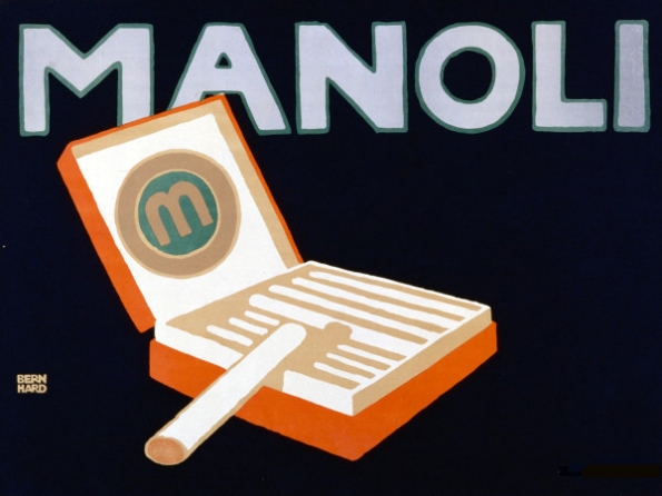
Field Journa l#6: Cigarette Ads
Up until the late 20th century, cigarette advertising was one of the most profitable businesses! This was mostly because in the 1950's smoking was incredibly popular.
Many cartoon characters were seen smoking. Fred Flinstone had a cigarette ad, himself. Wolverine is known for smoking cigars. In the 1950's, pseudo-3d techniques were sometimes employed in ads. They were seen in movie theaters, commercial breaks for popular TV shows,
It is partially because of Joe the Camel, "Cool" ads and many other delusional advertising campaigns, -- not just the fact that smoking is plain bad for you -- that America has realized that it needs to cut back on smoking ads, perhaps even making it harder to be a smoker in America.
Tuesday, October 30, 2012
Field Journal # 5
The Japanese Ukiyo-e influence was the greatest influences in Art Nouveau. Thanks to Art Nouveau, the simplistic but stylish approach to graphic design is still evolving in our media to this day. Art Nouveau was a pivotal factor in simplifying a good portion of graphic styles. Of course, this was being worked on before, but still: Art Nouveau made Victorian style look overly complex, hard-to-understand, and lavish in comparison. While Victorian was more about a focus on realism, Art Nouveau and everything after it represented the importance of being eye-catching. Without Art Nouveau, the fantastic place we are today in the looks of graphic design would be less exciting, with less instantly memorable logos, less flashy advertising, and so forth. After all, Art Nouveau brought us the General Elecctric logo, which still today survives.

Henri de Toulouse-Lautrec is a great example of a figure who represented Art Nouveau, as he used simple colors and line qualities on his posters, but he never failed to deliver attractive graphics. To make things more interesting, his "regular paintings" were much more detailed, well-painted post-impressionist paintings. He made life look very theatrical, authentic and dramatic, without having to make it super-realistic.
One of my favorite works from Henri de Toulouse-Lautrec is still "La Tournée du Chat Noir," due to it's being a well-shaped cat, mysticism in the grey lines on top of black, great use of shapes in general, fun letters, and so forth. My sister saw the original in Europe; I wish I was there.
- EBEN S.
One of my favorite works from Henri de Toulouse-Lautrec is still "La Tournée du Chat Noir," due to it's being a well-shaped cat, mysticism in the grey lines on top of black, great use of shapes in general, fun letters, and so forth. My sister saw the original in Europe; I wish I was there.
- EBEN S.
Monday, October 22, 2012
Field Journal # 4: Political Cartoooning
As photography advanced to the point that it could be used regularly, drawing for news was quickly pushed to concern the realms of farce and fiction. However all hope was not lost!Thomas Nast is a person I find quite fascinating. He revitalized drawing for news by converting his complex, highly truthful style -- which won Harper's New Monthly Magazine many viewers during the American Civil War-- into a somewhat simpler style which incorporated satire and symbolic characters that survive today. These characters include Uncle Sam, Santa Claus, and the Democratic Donkey and Republican Elephant.
Thomas Nast helped really start the world of editorial cartooning and comics. Without him, drawing would be stuck in the sector of children's books and fiction for a great deal longer. I have found that political cartoons are a particularly appealing way of expressing one's feelings about current events and politics. It provides a more "fun" way to look at such things, perhaps "cartoons for adults."
I find it rather tragic, however, that Thomas Nast died of yellow fever when he arrived in Guayaquil, Ecuador in December 7th 1902 after President Theodore Roosevelt appointed him consul of said place in Ecuador in his honor.
Tuesday, October 16, 2012
Field Journal #3: Typography
I have always considered myself a font and typography enthusiast. As I mentioned last post, back when I was a toddler I could read the word "pizza" even if the Z's looked liked number 3's! Much later on in life, I figured that this was a mere difference in either handwriting style or typeface, depending on which method was used to make it. When I started using computers more often and composed digital comics with it, I often found myself searching for free font collections on the web to contribute to my powers of expression.
By the way, what you on the right just happens to be a ligature letter, often seen in languages such as Norwegian and Danish. It is called "ligature Æ" ("æ" lowercase) and is essentially a compound letter of A and E. In Norwegian and Danish it is used quite often, and gives you an equivalent usage to "Ä, with umlaut" in German. It is also notably used for Latin texts and a few words in English sometimes such as "mælstrom," "encyclopædia," and "mediæval."
Anyway, at some point I was so interested in typography that I had my folks buy me some typography software to see if I could make my own fonts for kicks:
By the way, what you on the right just happens to be a ligature letter, often seen in languages such as Norwegian and Danish. It is called "ligature Æ" ("æ" lowercase) and is essentially a compound letter of A and E. In Norwegian and Danish it is used quite often, and gives you an equivalent usage to "Ä, with umlaut" in German. It is also notably used for Latin texts and a few words in English sometimes such as "mælstrom," "encyclopædia," and "mediæval."
Anyway, at some point I was so interested in typography that I had my folks buy me some typography software to see if I could make my own fonts for kicks:
Of course, I figured that I could do much better than the first time, so I figured that I could just try doing it again, albeit with a different style.
One of my favorite classic typefaces to date is "Bodoni," so naturally I paid some extra attention when Bodoni was mentioned in the textbook. I appreciate the contrast of the thick and thin lines. I've always thought that is what made that font special and aesthetic.
Tuesday, October 9, 2012
Made-Up Writing Languages (Field Journal #2)
Besides a handful of first basic words, I was fascinated by the red "not sign" composed of a circle and a line going through it. I could also read a simple word like "pizza" even if the font was messy or the Z's looked like number 3's.
Much later on in my life from this, I learned the Greek alphabet and most of the Russian alphabet just for kicks. I consequentially made many more of my own experimental writing alphabets by my own, sometimes either to see if I could write a paragraph in a suited made-up language, or just for a code alphabet for journals and secrets.
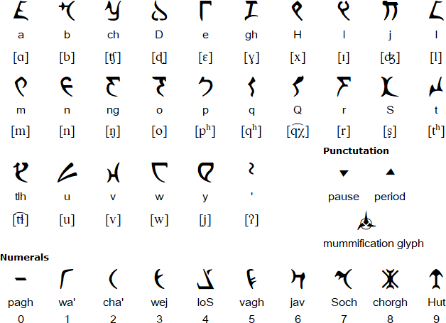
I was inspired by the efforts constructors of the Klingon language based off Star Trek to become a constructed language to outdo Esperanto (which I find highly improbable, but oh well). Below is the Klingon alphabet adapted as an actual alphabet, with their transliterations. Some of the consonants are very unusual, so it's better to read the third one down, if you know the IPA (International Phonetic Alphabet) to read dictionary-style pronunciation.
In case you need to see it in action, below is an example of a few sentences in Klingon.
After looking at this and other inspirations, it occurred to me that surely there may easily be nothing universal about the way certain writing languages work. When you have a phonetic writing system, why make letters for sounds not in your language? A writing language usually only documents the sounds, syllables, words, etc that are represented already in the spoken counterpart of the language.
Some interesting links:
http://www.omniglot.com/ (a great website to discover various writing languages, such as Klingon)
http://www.omniglot.com/writing/klingon.htm (the specific page on Klingon)
Tuesday, October 2, 2012
Field Journal # 1
When I saw and read every picture of the assigned book, Megg's History of Graphic Design, I was stunned at the how the human level of expression has evolved. Every century, few decades, or era or so, I see radical differences overall in the fashion, capability, and tools of graphic design. I was excited to see the increasing bravery of expression in the designers as time went on, as well as the diversity and universiality of subject matter. Some areas I found more interesting were typography, satire and logos, but I wouldn't say these were the only interesting areas at all! The World War II era contribution to design was cunningly fast, to the point that one could have had about 50 years of history in more or less a decade. The Japonisme of the Art Nouveau was interesting, as it pointed out that you can have inspiration from all over the world and still have a down-to-earth result. As I always am, I found the Renaissance the momentous part of graphic design history, as it broke away from many of the conservative aspects of Medieval life.
I have very few, if not, no disappointments in viewing all the images in this graphic design history book.
Subscribe to:
Posts (Atom)