Tuesday, October 16, 2012

Field Journal #3: Typography

 I have always considered myself a font and typography enthusiast. As I mentioned last post, back when I was a toddler I could read the word "pizza" even if the Z's looked liked number 3's! Much later on in life, I figured that this was a mere difference in either handwriting style or typeface, depending on which method was used to make it.  When I started using computers more often and composed digital comics with it, I often found myself searching for free font collections on the web to contribute to my powers of expression.
By the way, what you on the right just happens to be a ligature letter, often seen in languages such as Norwegian and Danish. It is called "ligature Æ" ("æ" lowercase) and is essentially a compound letter of A and E. In Norwegian and Danish it is used quite often, and gives you an equivalent usage to "Ä, with umlaut" in German. It is also notably used for Latin texts and a few words in English sometimes such as "mælstrom," "encyclopædia," and "mediæval."
Anyway, at some point I was so interested in typography that I had my folks buy me some typography software to see if I could make my own fonts for kicks:
Of course, I figured that I could do much better than the first time, so I figured that I could just try doing it again, albeit with a different style.
One of my favorite classic typefaces to date is "Bodoni," so naturally I paid some extra attention when Bodoni was mentioned in the textbook. I appreciate the contrast of the thick and thin lines. I've always thought that is what made that font special and aesthetic.

Tuesday, October 9, 2012

Made-Up Writing Languages (Field Journal #2)

Even before my readings in my graphic design history class nowadays, the idea of many, many writing languages and utilities such as writings symbols like pictographs have caught my fancy.
Besides a handful of first basic words, I was fascinated by the red "not sign" composed of a circle and a line going through it. I could also read a simple word like "pizza" even if the font was messy or the Z's looked like number 3's.
Much later on in my life from this, I learned the Greek alphabet and most of the Russian alphabet just for kicks. I consequentially made many more of my own experimental writing alphabets by my own, sometimes either to see if I could write a paragraph in a suited made-up language, or just for a code alphabet for journals and secrets.
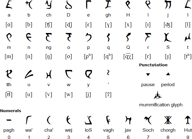
I was inspired by the efforts constructors of the Klingon language based off Star Trek to become a constructed language to outdo Esperanto (which I find highly improbable, but oh well). Below is the Klingon alphabet adapted as an actual alphabet, with their transliterations. Some of the consonants are very unusual, so it's better to read the third one down, if you know the IPA (International Phonetic Alphabet) to read dictionary-style pronunciation.

In case you need to see it in action, below is an example of a few sentences in Klingon.
After looking at this and other inspirations, it occurred to me that surely there may easily be nothing universal about the way certain writing languages work. When you have a phonetic writing system, why make letters for sounds not in your language? A writing language usually only documents the sounds, syllables, words, etc that are represented already in the spoken counterpart of the language.


Some interesting links:
http://www.omniglot.com/ (a great website to discover various writing languages, such as Klingon)
http://www.omniglot.com/writing/klingon.htm (the specific page on Klingon)

Tuesday, October 2, 2012

Field Journal # 1

When I saw and read every picture of the assigned book, Megg's History of Graphic Design, I was stunned at the how the human level of expression has evolved. Every century, few decades, or era or so, I see radical differences overall in the fashion, capability, and tools of graphic design.  I was excited to see the increasing bravery of expression in the designers as time went on, as well as the diversity and universiality of subject matter.  Some areas I found more interesting were typography, satire and logos, but I wouldn't say these were the only interesting areas at all!  The World War II era contribution to design was cunningly fast, to the point that one could have had about 50 years of history in more or less a decade.  The Japonisme of the Art Nouveau was interesting, as it pointed out that you can have inspiration from all over the world and still have a down-to-earth result.  As I always am, I found the Renaissance the momentous part of graphic design history, as it broke away from many of the conservative aspects of Medieval life.
I have very few, if not, no disappointments in viewing all the images in this graphic design history book.

Thursday, January 26, 2012

Some Cool Website Headers

On the Website Kotaku.com, you get the header you see below. I love it for its pseudo-Japanese look and its angle:

On iPlayWinner.com, you used to get this header, I liked it too, for its crown logo, representing the idea of winning in an arcade fighting game:

Here is a very illustrative one for VGJunk. I like this one, since it easily explains that it is a website about videogame nostalgia by being very pixelated over almost a Mario-esque logo:

How I Made My New Header Image

As you might see, my header is no longer a piece of text: it is now an image that looks like text!
1. The font that I used is called Blox BRK.
2. I downloaded the font a while ago, but I probably got this font for free at UrbanFonts.com.
3. The image editing techniques I used include drop shadow, resizing via stretch, pattern overlay, color overlay, and a white outline/ stroke. I actually experimented a few times to get it to work the way I wanted.

Friday, January 20, 2012

Pictures on other websites

http://www.flickr.com/photos/splat/82170728/in/set-981332/
This PNG (probably) I love because of it's cartoony, unique art style, with it's purple colors.

http://www.flickr.com/photos/splat/68420481/in/set-981332
This JPEG is cool because the stockings on the website are an unusual thing to place. Also, the stockings have great dimension as well as color to them.

http://www.flickr.com/photos/splat/126411424/in/set-981332
This website has a good number of artsy gifs. Great shapes to them.

JPEG vs PNG vs GIF

1. The cropping techniques that I use in my pictures involve the magic wand tool, the lasso selection tool, etc. I also crop my canvas whenever I make a Flash animation.
2. Pictures optimized as jpg are more complex, more colors, any canvas size; more likely to be a photograph.
3. Pictures optimized as gif has less colors, much less canvas size; often an icon, or is animated.
4. Pictures optimized as png are less complex, more colors with less shades, any canvas size; may be a cartoon, clip art, logo, map, etc.
a. It's better to use Jpeg when the image doesn't need to be reused at all, or if the image is primarily a photograph. It has "color loss" which makes it so the picture is harder to edit, but easily compressed.
b. Gif's and PNG's have less color loss or even no color loss compared to JPEG, so those formats are great when you want you material to be edited, used, etc.